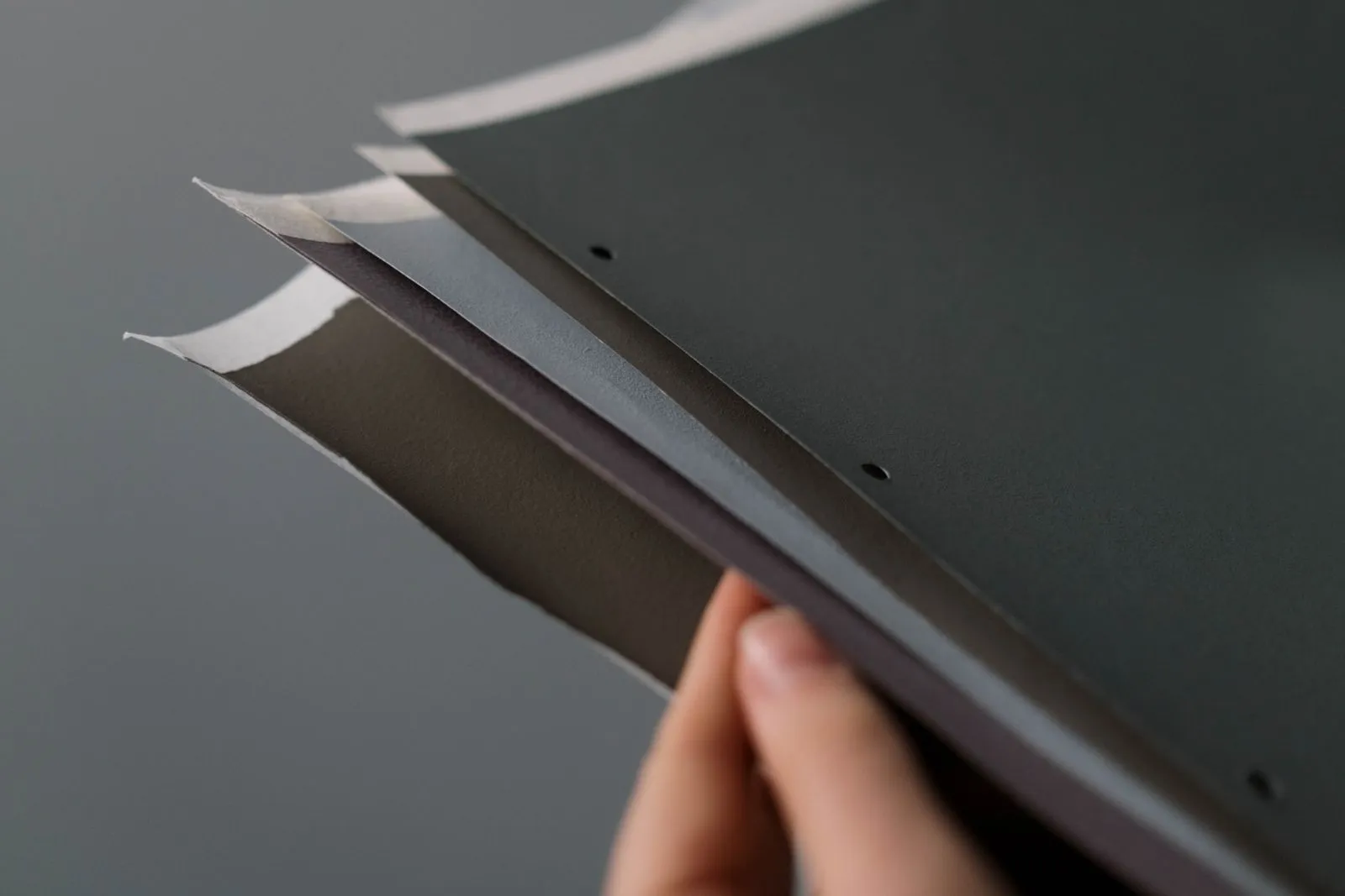
Paper is part of the design in a risograph project, not just the surface beneath the ink. Its weight affects how sturdy a print feels, its texture influences how colors and fine details appear, and its color can shift the mood of the whole piece. Before choosing a stock, consider how the print will be handled, what details matter most, and whether you want the paper to blend in or stand out.
Choose a weight for the use
Lighter paper suits flyers, inserts, and pages that need to turn easily. It keeps a project flexible and can make a larger run easier to handle. Because risograph printing applies ink to the sheet, very thin stock may feel less substantial and can show marks or color from the reverse side. Ask for a sample if your design uses broad areas of ink or will be printed on both sides.
Heavier paper gives postcards, covers, and art prints a firmer feel. It can make a piece seem more durable, but a thick or rigid stock may not feed well through every machine. The best choice depends on the studio’s equipment and the job’s format. Share the paper weight and intended use with your printer before settling on stock.
Let texture guide the look
Smooth paper generally supports crisp lines, small type, and fine details. It gives ink a more even-looking surface, which can help a clean, graphic design feel sharp. If your project depends on precise lettering or thin strokes, test a proof at the size you plan to print. Tiny details can look different once ink meets the actual paper.
Textured or uncoated paper brings a tactile, less polished character to a print. Its surface can make ink coverage look varied, and fine lines may appear softer than they do on smooth stock. That variation can complement handmade artwork, simple shapes, and layered colors. Check a sample under good light, especially if the design uses small text or large solid areas.
Use paper color intentionally
White and natural-toned stocks create different starting points for your ink colors. Bright white can make colors feel clear and high-contrast, while cream or warm-toned paper can soften the overall palette. Since risograph inks are often translucent, the sheet’s color may show through and affect the result. A color that looks bold on screen may feel quieter on a tinted sheet.
Colored paper can add depth or become an active part of the design. Choose ink colors that remain readable against the stock, and consider how overlapping inks may look on that background. Request a proof or printed sample when color accuracy matters. Viewing the ink on the chosen paper is more reliable than judging a digital mockup alone.
Test the full combination
Paper weight, texture, and color work together, so evaluate them as a set. A lightweight, textured sheet may feel casual and flexible; a heavier, smooth stock may make the same artwork feel more formal. Make a shortlist based on how the piece will be used, then ask your printer which options are compatible with the press and finishing steps.
When possible, print a small proof on the intended stock. Check legibility, ink coverage, color contrast, and how the sheet feels in hand. For a folded piece, test a fold too; for a two-sided design, inspect both sides for show-through. A short paper test can reveal issues early and help you choose with confidence.
The right paper supports both the practical needs of your project and the feeling you want it to create. Start with how the print will be used, then compare samples for weight, surface, and color. If you’re planning a risograph project, North Shore Riso can help you consider paper options and arrange a proof before printing.