
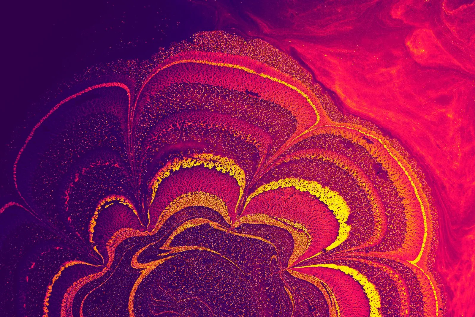
A risograph print has a look that feels both bold and handmade. Its color comes from separate layers of ink, applied one at a time, rather than a single full-color pass. That process can produce bright overlaps, visible texture, and small differences from one sheet to the next. Paper matters, too: its shade and surface affect how the inks appear. Knowing what to expect helps you choose artwork and materials that make the most of the process.
Color Builds in Layers
A risograph printer applies each ink color in a separate pass. The paper runs through the machine again for every additional color, so a two-color image is built from two layers, and a design with more colors requires more passes. This approach gives the artist control over each layer and makes color overlap part of the image, not just a printing detail.
Where transparent inks overlap, they can create a third color. For example, blue printed over yellow may appear green, depending on the inks and paper. Design with these overlaps in mind: separate your colors into clear layers, check how they interact, and leave enough room for the result to read as intended.
Small Variations Are Normal
Risograph printing is not identical to conventional digital printing. A sheet can shift slightly between color passes, which may leave edges that do not line up perfectly. Ink coverage can also vary across a run. These small differences give the finished stack a lively, tactile quality, but they are worth considering when preparing detailed artwork.
Fine registration-dependent details, such as tiny text printed across two colors, can be harder to keep crisp. For cleaner results, use solid shapes, allow a little breathing room between colors, and avoid relying on hairline borders to conceal shifts. If precise alignment is essential, discuss the design with your printer before the run.
Paper Changes the Result
Paper is part of the color palette. An uncoated sheet absorbs ink and often gives the image a softer, more textured appearance. A bright white paper can keep colors feeling clear, while a cream or colored sheet can warm or alter their appearance. The same ink may look different on different stocks, so a screen preview cannot show the whole effect.
Consider both the paper’s surface and its weight. A smooth sheet can make small details easier to see; a more textured sheet adds visible character. When the final look matters, ask to review printed samples on the paper you plan to use. Choose a stock that suits the artwork and how people will handle or display it.
Design for the Process
Start by deciding which elements belong in each color layer. Keep important text and fine details on a single layer when possible, and use overlaps intentionally for added hues or depth. Make sure the design still works if a layer shifts slightly. A simple test print can reveal interactions that are difficult to judge on a screen.
Expect the finished prints to share a common design without being perfectly identical. That is part of risograph’s appeal, especially for posters, art prints, invitations, and small publications where color and material matter as much as uniformity. North Shore Riso can help you consider ink layers and paper options before printing.
Risograph printing combines layered color, the occasional small variation, and paper that contributes its own tone and texture. Plan for those qualities rather than treating them as flaws, and they can become strengths in the finished piece. If you have a design in mind, reach out to North Shore Riso to discuss paper samples and color layers.